Sun and Star
Sunset Threads:

I'm having trouble figuring out what these photos really look like, because everything looks dark on my computer screen no matter how I adjust the settings. I realized recently that adjusting photos so they look right on my screen makes them look washed-out on other people's computers.
Sunset Rocks with the original exposure:

Sunset Rocks adjusted to look right on my screen:

Starfish Swim 1:
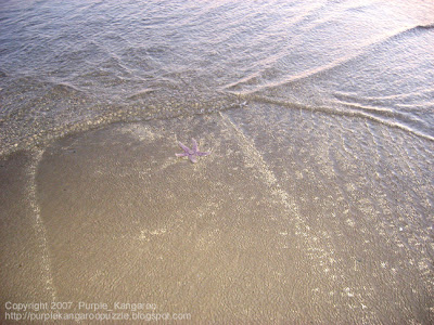
Starfish Swim 2:

Do these look dark or pale to you? Which version looks better on your screen? (Click on any photo to see a larger version.)
Labels: snap happy, travel
Copyright 2009. All rights reserved.
Posted by purple_kangaroo at 11:15 AM[Permanent link]
![]()
![]()


13 Comments:
You're right. The darker ones (Sunset Threads, Sunset Rocks with the original exposure, Starfish Swim 2) look richer and the lighter ones look washed out to me.
Do you have an LCD or CRT? Assuming you've played with its controls, you might be able to find some software controls in Control Panel -> Display -> Settings -> Advanced -> Color Tab.
Starfish 2 looks fine on my screen. Sunset Rocks 2 is definitely too light on my screen, but the first one is too dark, and I can't see the detail of the grasses or the beach below. Somewhere in between the two would work better for that shot. --Kathy J.
This comment has been removed by the author.
Kevin, I have a CRT (Dell E770s) and the brightness and contrast are both set at 100%. I tried looking in the advanced display settings as you recommended, but I don't have a "Color Tab" option. I do have a "Color Management" option, which lets me select a color profile (set of colors) for my monitor to use. Currently it's selected as none. I wouldn't know which to select--there are several dozen options. There's no option to adjust brightness from there. Any ideas?
Thanks for the input from you, too, Kathy. That's helpful.
The light wasn't very good for any of these shots, actually, because they were all taken at various stages of sunset and I don't yet know how to adjust the camera for less light than normal daylight. The Sunset Threads photo is the original exposure, but the lighter starfish pic is the original exposure. The darker version of the starfish is what my photo editing program auto-corrected it to.
I'll have to post some pics taken in daylight for comparison.
I'm with the rest of the crowd. Your original pics look best unedited.
Looks like your vacation was lovely. :)
Your contrast might need to be turned down to show subtly different shades better. Here are a couple of pages you can use to calibrate your monitor's brightness and contrast: EPP and Alpenglow.
If that doesn't work, you might be able to use something like QuickGamma, though I've never used it myself.
Dell e770s troubleshooting also suggests that performing a monitor reset and possibly degaussing might help.
I would think your husband would be able to help you with this. ;) If you have already tried all the adjustments that people have mentioned and you are still having this problem, you might just need a new monitor. I know I have had CRT's in the past that displayed graphics and pictures very dark and with poor contrast. That's probably not what you wanted to hear.
I like the original exposure Sunset and Starfish Swim 2 - especially with the Starfish, the play of light on water is much richer in the number 2.
I agree with Kevin. Original sunset and starfish 2 look perfect on our screen.
looks like a beautiful place and a nice vacation although i totally understand what you said about how it's not exactly relaxing. :)
I'm going to go with the consensus here, and say that the darker ones displayed here look fine. What shows up as "too dark" on your home monitor actually translate into fine images on our end. When you try to adjust the colors, the images look fine to you, but appear washed out and pale to us.
I don't know WHY that is, but that's what's happening. I have heard of other people complaining that the images they are trying to load appear too dark, but they always seem fine to the viewer. Odd.
Wow, thanks so much for all the helpful comments, everyone. Kevin, the links you found were very helpful. I've determined that there is just something wrong with my monitor. No matter how I adjust it, it's still way too dark. I'm pretty sure it's been like that since I got it--too bad I didn't realize the problem sooner.
DH, however, very sweetly agreed to trade monitors with me if I can put up with the way his screen flickers. So I'm going to see if I can get the dark point and gamma adjusted properly on his screen.
Post a Comment
<< Purple Puzzle Place Home